Common Website UX Mistakes and How to Fix Them


We experience it every day—the confusing street sign, the door you don’t know whether to push or pull, or the clamshell packaging that just. won’t. open. On the web, it’s the button that goes nowhere, the form you can’t fill in, or pop-up that covers your entire screen. If you’re a human being in the world today, you’ve encountered bad user experience—probably several times before you even eat breakfast.
Today, there’s an entire industry of professionals dedicated to improving the user experience (UX) on different websites. For those of us building our own websites, you are the UX designer. Though there’s a lot to learn, you can easily avoid some common UX mistakes that designers, developers, and DIY’ers alike all run into.
What is UX?
What is user experience (UX)? If you go to a website and find everything you need quickly and efficiently, that’s a good user experience. If you visit a website and aren’t sure where to click, or you get stuck somewhere and can’t find what you’re looking for, that’s a bad user experience. As with many things in life, you typically only notice UX when it’s bad.
Let’s look at some frequent UX mistakes and highlight what you can do to correct them.
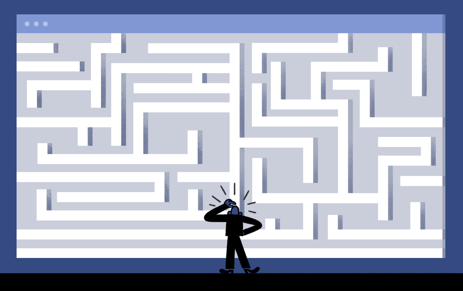
UX Mistake 1: Serving “mystery meat”
When you’re presented with a clickable icon, button, or image and you have no idea what it does or where it’s going to take you, that’s mystery meat. Coined in the late 90’s by web designer Vincent Flanders (the founder of “Webpages That Suck“), it’s in reference to designs that are clear to the designer, but simply baffling to anyone trying to use it.
A lot of times this mystery meat appears when people try to get creative with a tried-and-true design. Think of the hotel shower faucet that you cannot figure out how to use, even though you’ve been successfully taking showers for years.
Over time, we’ve all been trained to look for specific cues to navigate online—a little phone icon will lead you to the phone number, a magnifying glass takes you to search, etc. Throw an unexpected or ambiguous choice into the mix, and people get confused.
Bring your business online with Jimdo.

If you’re worried that your website may be riddled with mysterious icons, buttons, or directions, ask yourself, “if this is the first time I have ever been to this site, would this make sense to me?” If the answer is “no,” it’s probably time for a change.
UX Mistake 2: Too many pop-up messages
You click a link, you start to read, and before get through the first sentence, a pop-up message fills the screen.”But I want to just read this article right here,” you say. “Too bad!” screams the pop-up, “Do THIS instead!!!!”
Why do web designers use something that’s so clearly annoying? Well, the problem is they actually work (for the website owner, that is). Nevertheless, businesses are based on trust, and websites are too—so don’t sacrifice your visitor’s experience for some quick but shallow conversion “wins.”
UX Mistake 3: Ignoring user feedback
When UX designer Chelsea Regnani was building her first mobile app, she asked a friend for feedback—though the results weren’t what she was hoping to hear:
“She found it confusing and didn’t understand what the app would be used for. I thought she was crazy. I immediately ignored her feedback and moved on to choosing the color scheme I liked best. It wasn’t until I shared that version with some other people that I got the same feedback as before. I guess I was the crazy one, I wasn’t listening and I got ahead of myself. Once I took a step back and reviewed all of my collected feedback, I found clear patterns and changes that I could have made easily if I had listened earlier on.”
It’s a mistake that even pros make, especially when someone is offering you feedback on a design you love and have worked hard on. But listening to user feedback early on can save you a lot of grief down the road. Fortunately, usability testing isn’t just for large companies. There are lots of services out there that will let you test your website on real-life users for a reasonable fee, like Usabilla or Usertesting.com.
UX Mistake 4: Forgetting mobile visitors
Mobile website usage (in other words, using a website on-the-go from a smartphone or tablet) has been on the rise for years. In 2015, Google announced that for the first time in history, more people were searching from mobile devices than from desktop or laptop computers. So even if you typically use a computer, chances are good that many of your visitors are coming via mobile.
All Jimdo websites are mobile responsive, but there are also some UX tricks you can use to make the mobile experience even more comfortable for your visitors. In fact, we list a lot of them right here.
UX Mistake 5: Reinventing the wheel
You might be thinking, hey, with all these “rules” about design, where’s the space to be creative? There are of course some instances where you want people to be challenged–art exhibits, obstacle courses, etc. Your website probably isn’t one of those.
You may want your website to be unique, but that doesn’t mean you should toss out the common standards and practices that make things easy to use. As Etsy’s creative director Randy J. Hunt puts it, “In every Web product you create, you should prioritize effective over clever.”
Websites have been evolving for years, but take note of the icons and placement that haven’t changed. The back button is always in the top left corner, contact info is typically at the bottom, etc. That’s where we’ve been trained to look. Don’t move the essentials around for the sake of your design.
For instance, if you’re building a form, it’s a good idea to ask for information in the order people are typically used to giving it—name, email address, etc. Starting out with fields that aren’t common can be confusing and will usually lead to mistakes.
UX means keeping the user in mind
UX mistakes are common, but if you remember to keep the user in mind throughout the design process, you can enhance the experience that you create.
Remember too that even UX experts don’t start out knowing all the answers. It’s a learning process. There are certainly core principles to follow, but the best way to improve your website is to learn over time.
Bring your business online with Jimdo.
Build your online presence with Jimdo
Create a website, sell online, and grow your business — all in one place.

🚀 Ready to take your business online?
No credit card needed. Online in minutes.