The perfect design for your one-page website


A one-page website is a great way to sum up your business.
But is a one-page website actually the best choice for you? Or would a multiple-page website suit you better? This article will give you the answers to these questions along with more tips for the perfect one-page website.
What is a one-page website?
A one-page website is a website made up of just a single page. All the information that visitors need to know about you and your business is concisely presented on this one page. This includes your offers, your company profile, your contact information, and more.
If you’re wondering about the legal notice, privacy policy, etc.—a one-page website requires these too. However, as with other websites, they’re outsourced to suitable subpages. This way, they don’t distract from the content on your main page. A one-page website usually consists of several pages, even if the vast majority of visitors only see one of them.
Who is a one-page website for?
A one-page website focuses on the fundamentals. It’s not for extravagant company descriptions or detailed product descriptions. One-page websites are a great option if you want to clearly present a limited amount of information.
One-page websites are ideal for:
- Freelancers and self-employed people
- Small businesses with simple offers
- Cafés and restaurants
- Product launches and campaigns
- Events, celebrations, and anniversaries
- Portfolios
If you have a cornucopia of essential content, you’re probably better off with a multiple-page website—e.g. you offer a variety of services that you want to explain in detail, or you want to incorporate multiple image galleries to display your work.
Another advantage of one-page websites: many internet users no longer read websites line by line, they just skim over them. The goal is to quickly find the information they’re looking for, without being held up by things they’re not interested in. Well-structured and clearly-designed one-page websites are perfect for this type of reading behavior.
3 design tips for the perfect one-page website
Here are some tips to get the perfect combination of design and content for your one-page website:
1. Less is more
Your content should be just like your one-page website: short and concise. Use engaging texts that stick to their core message and high-quality images that immediately grab your visitors’ attention.

The five Ws will help to keep your texts short and sweet: who, what, where, when, and why? Answer these questions, and your text will most likely contain all the key information relating to your topic. You can do without anything that doesn’t fit on your one page.
Make sure to include the following:
- Short introduction to your company
- Overview of your services
- Image gallery with your best work plus references
- Contact details (with optional contact form)
If you want, you can add photos of your employees, or include a tool for making online bookings.
2. A well-thought-out structure
If your website consists of multiple subpages, it’ll already have some kind of structure: each page covers a specific topic and can be accessed directly from the navigation bar.
The only structure for a one-page website is: from top to bottom. You should structure your content accordingly. Ask yourself which point is the most important to your visitors. Put this right at the top of your page. Then comes the next most important topic, and so on.
Your structure could look something like this:
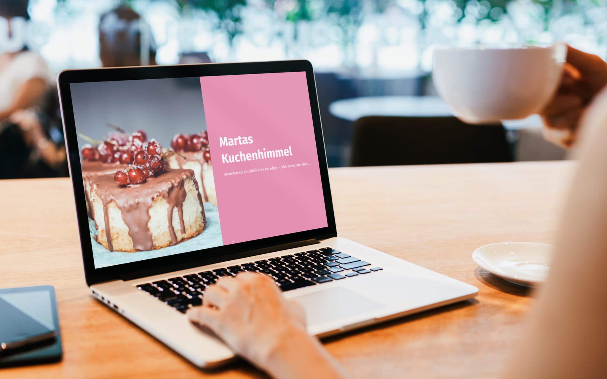
- Hero. Start with a large photo that perfectly encapsulates your work—a so-called “hero” or “hero image”. Add the name of your company and a line or two that describes what you offer. This is so that your visitors immediately know what service you offer and get a first impression based on your hero image.
- Description of your offer. Next, you should answer the question, “what do you actually do?” in a little more detail. Clearly and concisely list the most important cornerstones of your offer.
- Contact. Then you need a small section where your visitors can contact you directly. Include a call-to-action button, so they can instantly send you an email. Or a booking tool so your visitors can make an appointment with you. Or both.
- Portfolio & references. It’s worth having a small image gallery to show off the projects you’re most proud of in order to convince anyone who’s undecided about your work. Customer testimonials and a few impressive logos from your biggest customers are also a good idea, especially if you can’t show your work in photos.
- More information about you and your business. With the information above, you already have all you need to convince your visitors. But you can still finish it off with a bit of text about your career or your company values. Or photos of your employees. This extra content helps you build trust.
Your website could look like this:

3. Let pictures do the talking
Even if your texts are brilliant and convey everything your visitors really need to know—pictures explain things in a way that words can’t keep up with. Photos, graphics, and videos catch the eye, create atmosphere, and fill your content with emotion.
It’s worth noting:
- Images: Images are always the first thing to grab your visitors’ attention. You should allow enough time to choose the best images for your website. Luckily, there are a variety of online platforms nowadays where you can download high-quality royalty-free images at no cost. This will visually enhance your website and give it a professional look. In some cases, using your own photos is the best option. Especially if you need product photos for your online store. These photos should make your products appeal to your customers. They should also provide an accurate representation of the products so that your customers don’t get a nasty surprise when receiving your product and end up sending it back along with a bad review.
- Videos: Videos are perfect for presenting yourself or your products in a certain way. Moving images have a totally different effect from high-gloss polished photos. They make your content appear more dynamic and tangible. For example, if you’re showing off a vacation rental on your Jimdo website, it’s worth having a video that shows both the apartment and the surrounding area. This gives your visitors a coherent overall picture. But videos are also great for online stores to show a product in action.
- Slideshow: If you want to present a whole series of photos, we recommend displaying your image gallery as a slideshow. This saves a lot of space and allows your visitors to scroll through your images as they please.
SEO for one-page websites
Of course, you can optimize the content of your one-page website so that it’s easier to find on Google, etc. However, search engine optimization is comparatively limited for one-page websites.
The main reason for this is the keywords. For a website with multiple subpages, you can optimize each page with one or two keywords that are best suited to that content. On a product page with a glass-bead necklace, it could be “glass bead”, “necklace”, or something similar. However, if you want to promote a workshop where participants can make their own glass beads, “workshop”, “glass blowing”, and the name of your region (e.g. Massachusetts), are better keywords to use.
If you have one single page, we recommend optimizing your texts for just one set of keywords. Google and other search engines prefer websites with a clear message. If you cover too many topics on your one-page website and use too many keywords, search engines can’t rank your website properly. And that ultimately leads to poor search results.
Treat your keywords how you treat your content: focus on what’s really important. In other words, use the terms that best describe your offer and bring you the most visitors.
How to build your one-page website with Jimdo
Jimdo has the ideal building blocks for your one-page website. Instead of spending ages looking for the perfect design template, you can simply build your website block by block.
The best thing to do is to start off by thinking about what content you want on your one-page website. Then look for the appropriate blocks, establish the layout and individual elements of your page, and make sure they’re visually different from one another.

Your Jimdo website will initially consist of several subpages. You can easily hide these and just work with your main page. Here’s how:
- Switch your website to edit mode.
- In the top left of the menu, click on pages.
- Click on the three dots next to the page that you want to hide, and select either hide page link or delete.
Important! You can also hide the link to your home page so that your navigation bar looks tidy. Just make sure that you select the option hide page link. Because if you delete your home page, there’ll be nothing left of your website.
If you’ve removed all the links, you can completely hide your navigation bar.
- To do this, hover your mouse over your navigation bar and click on the eye symbol (show elements) on the left.
- Then deselect all elements, such as text and buttons.
After that, your navigation bar will no longer contain any elements and will be automatically hidden.
A one-page website proves you don’t always need a thousand words and pictures to convey what’s really important. Give it a go!
Build a strong business with Jimdo.
Create a website and get found, get booked, get paid – all in one place.

🚀 Ready to take your business online?
No credit card needed. Online in minutes.